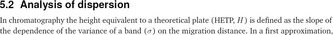
Tips on Writing a Thesis in LaTeX
The font
At the beginning of the thesis typesetting I used only one typeface — default LaTeX font, computer modern roman (CMR; see also Latin Modern):
\usepackage[T1]{fontenc}

After several months of working with 11pt CMR both on screen and paper, I have decided to look for some alternative, because CMR text appeared to me too "light". A brief search resulted in finding a good collection of free LaTeX fonts, where besides the font appearance one can get information on the installation and activation of a particular font in LaTeX. After few weeks of trying different fonts from that collection, I have stopped my choice on Bitstream Charter (Charter BT) as the font for the "body" text:
\usepackage[T1]{fontenc}
\usepackage[bitstream-charter]{mathdesign}

Compared to other fonts, one of the things I really like in Charter is its good scalabilitybut I would not say this about bold Charter, at least
scalability of particular characters on screen. As a result, Charter has a relatively nice appearance on the screen at different magnification levels, which are typical if you work with PDF file in window or in "fit width" / "fit visible" / etc. display modes. The good scalability can be attributed both to the font "heaviness" and the design of Charter, which was optimized for low resolution laser printers.
The only thing I could complain about Charter is its "fancy" appearance of math :) which I did not like at all:
\usepackage[T1]{fontenc}
\usepackage[bitstream-charter]{mathdesign}
I was looking for some alternative for the math typesetting (i.e., text placed between $ characters, and in the equation environment) and finally decided to stay with the original CMR version of the math:
\usepackage[T1]{fontenc}
\usepackage{charter}
\usepackage[expert]{mathdesign}
As you see, use of the two aforementioned commands allows to typeset main text with Charter while math with CMR. The expert option of the mathdesign package can be omitted, but in this case I had issue with small capital characters (mainly used for author names in bibliography) — they were replaced by the normal ones.
After having some experience with the combination of Charter and CMR for text and math respectively, I can point out the following problems inherent to such combination of fonts with different weight:
- use of the math mode in the main text produces adjacent symbols strongly different by weight, which is illustrated by two text fragments below:
- writer has to decide which numbers to process as a normal text and which in math mode: the choice is not always trivial, and this most likely will result in different (CMR/Charter) typesetting of numbers in situations with similar context.
Greek "mu" story
After switching the math mode font I have faced issues with Greek symbols which had to be typeset in the main (non-math) text. The issues occurred because Greek symbols are typically typeset in LaTeX via math mode (which was in CMR instead of Charter). A particular example of using Greek symbol in the main text was Greek non-italic "mu" (μ) typeset in Charter to indicate prefix "micro-" in the text. The solutions I have found suggested to use packages upgreek, gensymb, and/or textcomp together with \upmu and \textmu commands. Unfortunately, none of these combinations gave positive result, and LaTeX produced either non-italic CMR or italic Charter Greek mu:
% default, $\mu$ is used to type Greek "mu",
% resulting in CMR italic "mu"

\usepackage{upgreek}
% $\upmu$ is used in text to type Greek "mu",
% resulting in CMR non-italic "mu"

\usepackage{textcomp}
% \textmu is used in text to type Greek "mu",
% resulting in Charter italic "mu"

After trying different approaches, I came up with the following solution:
\DeclareMathVersion{mathchartertext}
\SetSymbolFont{letters}{mathchartertext}{OML}{mdbch}{m}{n}
\newcommand{\charmu}{\mathversion{mathchartertext}$\mu$\mathversion{normal}}
% \charmu is used in text to type Greek "mu",
% resulting in Charter non-italic "mu"

The idea behind the last command set is to define a new command (\charmu) which locally changes math font from CMR to Charter and types "mu". With the \DeclareMathVersion{...} command (see p. 13 in LaTeX 2e font selection) a new math font version mathchartertext is defined, \SetSymbolFont{...} customizes the mathchartertext to have non-italic Charter, and \newcommand{\charmu}{...} specifies the new command to be used to enter Greek "mu" with the font settings of mathchartertext. The presented solution is probably not the most elegant one :), but this is only how I managed to get it working.
The limitation of \charmu is that it prints only the predefined Greek character ("mu"). After the following modification any Greek character can be printed as non-italic Charter:
\DeclareMathVersion{mathchartertext}
\SetSymbolFont{letters}{mathchartertext}{OML}{mdbch}{m}{n}
\newcommand{\gchar}[1]{\mathversion{mathchartertext}$#1$\mathversion{normal}}
% The \gchar{\char} can be used in text to type
% Charter non-italic Greek characters.
% Usage example: \gchar{\phi}
The command \charmu (or \gchar) does not work in the titles of references in the bibliography. The workaround here is to use \mathversion{mathchartertext} right before \printbibliography command (which actually outputs bibliographic records cited in the main text), and to use standard $\mu$ to get Charter Greek "mu" in the titles of bibliographic records.
Headings
In addition to the body text and math mode, I decided to change typeface of the headings (i.e., titles of chapters, sections, sub-, and subsubsections) to the font without serifs (also called sans-serif font). This was done because the headings were typeset in bold and have font sizes larger than the body text; in my opinion serifs of the main font (Charter) in this case should be avoided (actually, bold headings without serifs is a common practice: 1, 2, 3). To customize the the headings font I have employed titlesec package. Before proceed to the sans-serif headings, I provide two examples containing commands to typeset the headings in Charter and CMR serif fonts. Charter:
\usepackage{titlesec} % www.ctan.org/tex-archive/macros/latex/contrib/titlesec/titlesec.pdf

% Below "\section" can be replaced with "\subsection" and "\subsubsection"
% in order to customize the corresponding headings
\titleformat{\section}[hang]{
    \usefont{T1}{bch}{b}{n}\selectfont} % "bch" - Bitstream Charter, "b" - bold
    {} % label
    {0em} % horizontal separation between label and title body
    {\hspace{-0.4pt}\Large \thesection\hspace{0.6em}} % code preceding the title
    [] % optional code following the title body

Customization is done using the \titleformat command. Its second mandatory parameter (\usefont{...}) actually changes the font, while the second last parameter includes
- \hspace{-0.4pt} — spacing before the section number ("5.2"),
- \Large — adjust the font size (notice the space after it),
- \thesection — section counter (prints the section number),
- \hspace{0.6pt} — additional horizontal spacing between the section number and the following section title. (See also notes on spacing.)
The above code can be modified to typeset headings with CMR serif font:
\usepackage{titlesec}
\titleformat{\section}[hang]{
    \usefont{OT1}{cmr}{bx}{n}\selectfont} % "cmr" - computer modern roman, "bx" - bold extended
    {}
    {0em}
    {\hspace{-0.4pt}\Large \thesection\hspace{0.6em}}

After looking in tug.dk font collection for a suitable serif font for headings, I have stopped my choice at TeX Gyre Heros:
\usepackage{titlesec}
\titleformat{\section}[hang]{
    \usefont{T1}{qhv}{b}{n}\selectfont} % "qhv" - TeX Gyre Heros, "b" - bold
    {}
    {0em}
    {\hspace{-0.4pt}\Large \thesection\hspace{0.6em}}
The chosen TeX Gyre Heros is the font not only without serifs, but also has heavier weight compared to Charter — this results in a good visual separation of the headings from the rest text making TeX Gyre Heros a good companion for the body text typeset with Charter. In addition to TeX Gyre Heros, reader may take a look at the bold version of Computer Modern Sans Serif as a candidate for the headings font.
Chapter title font
As stated in its documentation, titlesec package replaces original LaTeX macroses for the heading commands (i.e., \chapter, \section, etc.) which requires assignment of all settings defining the heading command, even if you want to change only one of it (for example, font). This can be seen in the code blocks above where in order to change the heading font with \titleformat command (\usefont{OT1}{cmr}{bx}{n}\selectfont}) settings for the heading number, its location, and its font size were given too ({\hspace{-0.4pt}\Large \thesection\hspace{0.6em}}).
While preparing thesis I decided to modify (i.e., do not redefine) default \chapter macro, and did this with sectsty package. By default, after switching the document font to Charter each chapter title appeared like this:
%--- document preamble
%--- activation of Charter for text and CMR for math
\usepackage[T1]{fontenc}
\usepackage{charter}
\usepackage[expert]{mathdesign}

%--- document body, new chapter
\chapter{Numerical methods}

As discussed above, sans-serif TeX Gyre Heros font was chosen for the headings. Its activation for the chapter titles was done using the following addition to the preamble commands in the code block above:
\usepackage{sectsty}
\chapterfont{\usefont{T1}{qhv}{b}{n}\selectfont\huge}

where not only heading font was changed (\usefont{T1}{qhv}{b}{n}\selectfont}), but also size of the chapter title "Numerical methods" was made smaller using \huge command.
The last command set changed font also in the title of the references list (bibliography)
Font in table of contents
The commands discussed above change font in the body text, math mode, and headings (including bibliography), but have no influence on the fonts in table of contents (ToC):
% default, after activation of Charter for text,
% CMR for math, and Heros for headings
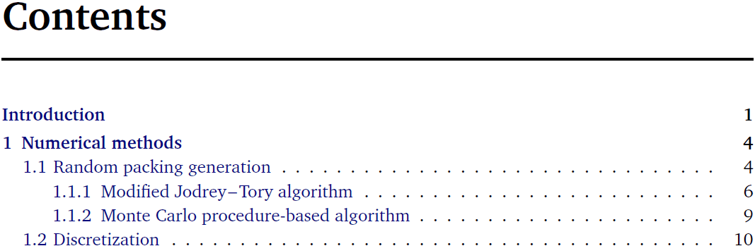
Fonts in ToC can be adjusted with the package tocloft, which I actually used:
\usepackage[subfigure]{tocloft} % subfigure option only if using subfigure package
\renewcommand{\cfttoctitlefont} % ToC title
             {\usefont{T1}{qhv}{b}{n}\selectfont\huge}
\renewcommand{\cftchapfont} % chapter titles
             {\usefont{T1}{qhv}{b}{n}\selectfont}
\renewcommand{\cftsecfont} % section titles
             {\usefont{T1}{bch}{m}{n}\selectfont}
\renewcommand{\cftsubsecfont} % subsection titles
             {\usefont{T1}{bch}{m}{n}\selectfont}
\renewcommand{\cftchappagefont} % chapter page numbers
             {\usefont{T1}{bch}{b}{n}\selectfont}
\renewcommand{\cftsecpagefont} % section page numbers
             {\cftsecfont}
\renewcommand{\cftsubsecpagefont} % subsection page numbers
             {\cftsubsecfont}
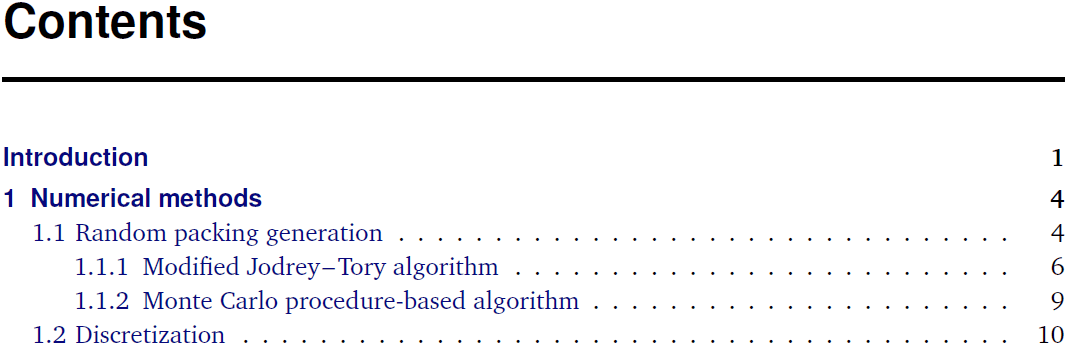
As you see, font TeX Gyre Heros was used only for the ToC title and headings typeset in bold (which are chapter ones). Charter was kept for the rest of ToC, including bold page numbers of chapters in order to preserve uniformity and flatness of the column with page numbers. Package option [subfigure] was needed to avoid conflict (error at \newcounter{lofdepth} \setcounter{lofdepth}{1}) with subfigure package if you use it; otherwise this option has to be removed.
page not just by fast scrolling the information presented on this web site, and would like to support development of this project you may consider buying me a coffee.